News Deserts by Community Type and Vote Share
News Deserts by Community Type and Vote Share
It's what you think but also not what you think and not so obvious.

I totally get how people get into coding zone or hyperfocus, which really does key in so well to ADHD. I legit haven’t been able to think about anything other than messing with this new News Desert data set from Northwestern. My primary interest was just in practicing running some regressions for class - the big question for me is whether these news deserts are worth worrying about and how much? - if we talk about local newspapers specifically - really, how much does dead tree news continue to matter? I’ve always had some frustrations with the term and the moral panic, which you can read a little bit about here.
So when I accepted the advice of my tutor for my PhD methods class that I needed to get some data I cared about to start messing with, at first I thought I’d answer my longstanding question about whether wearing Nike clothing as a tennis player is correlated with better tennis and more earnings, but… then I saw the new dataset was out. So while I haven’t played with all of the data yet, I’ve messed around with the 2023 data for total newspaper per county. You can read more below, but here are the big takeaways - trust as you will given limitations of my comprehension - and note: this is all based on the theory that more total newspapers in a county is an indicator of a more robust local news ecosystem.
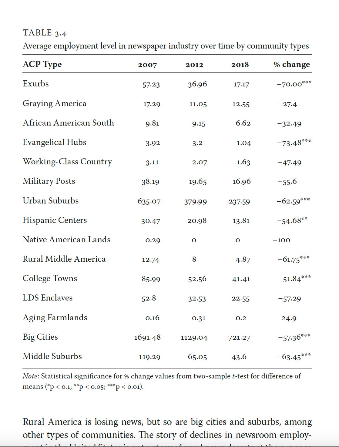
Place matters: different places have different stories to tell about how their culture, economics, demos, etc. intersect with the health of a local news ecosystem. Generally, being in a big city means you’ve got the MOST total newspapers, relative to other counties. That makes sense. But if a place is one of the following: Working Class Country, Hispanic Centers, Aging Farmlands, Evangelical Hubs, Native American Lands, well, it really doesn’t seem to matter insofar as predicting whether there are more or less newspapers present. This is consistent with my findings in News for the Rich, White, and Blue: How Place and Power Distort American Journalism (see table at the end) - where I focused on newspaper employment totals.
Extreme vote share for Trump DOES NOT seem to have important interaction effect on the relationship between type of community and predicting the total number of newspapers, for the most part. The percentage of the Trump vote in a also doesn’t seem to be predictive for predicting the total number of newspapers in a county or matter much relative to county type.
Lastly, extreme vote share for Trump does predict whether a place is likely to have fewer newspapers, but that’s holding the community type constant - so we don’t learn much other than places that voted a lot for Trump had fewer newspapers; moreover, the model doesn’t tell us anything about what those places are like.
I am a fan of big-ish data, data you can still feel and see and audit if necessary (so like, less than 10k rows of anything), but data whose themes feel textured and make sense to me. If I can’t really see the data or feel it (yes, there’s something material about data, ask me anything about artisanal hand coding), even at an empirically summarized level, can I believe it says something meaningful about the world?
And I’ve loved the American Communities Project data for a long time because it uses 39+ indicators to cluster all 3,143 American counties into 15 different county types. Working class country, African American South - the counties become places that have a bit more texture once you add county type.
So it seemed like the obvious first game to play was to marry this news desert data with the ACP data. (Note, when I merged this data, I dropped a county, and I can’t figure out how to audit this properly). Then, I had to add in some election data, the county-level returns for Trump in 2020. Like I said, texture
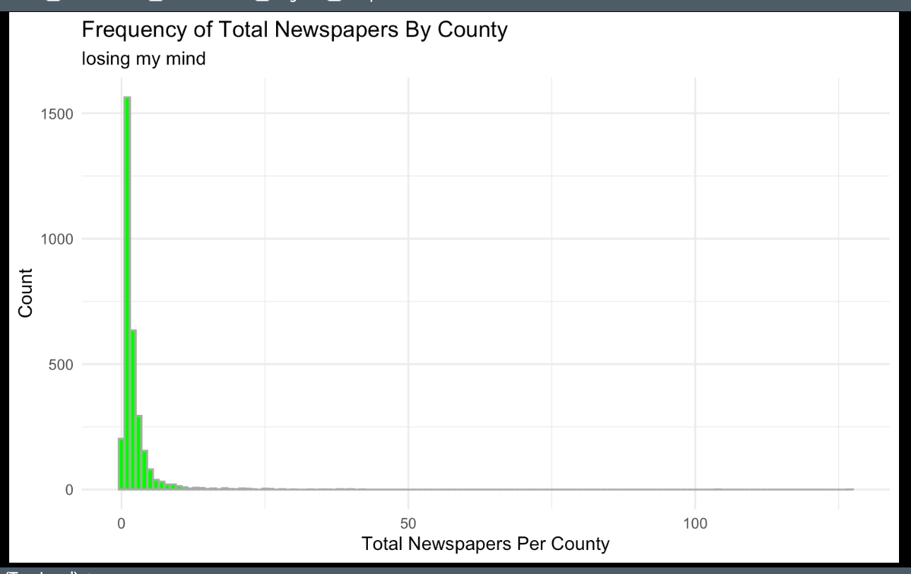
But there are a lot of problems with using any basic regressions at all with this data with the skilzz and knowledge I currently have: first, the total number of newspapers per county as a whole is not normally distributed - although it is a chi-square distribution, which gives me a little faith once more in statistics being able to at least acknowledge the real world beyond measurement theory. (LOOK AT MY HISTOGRAM!!).
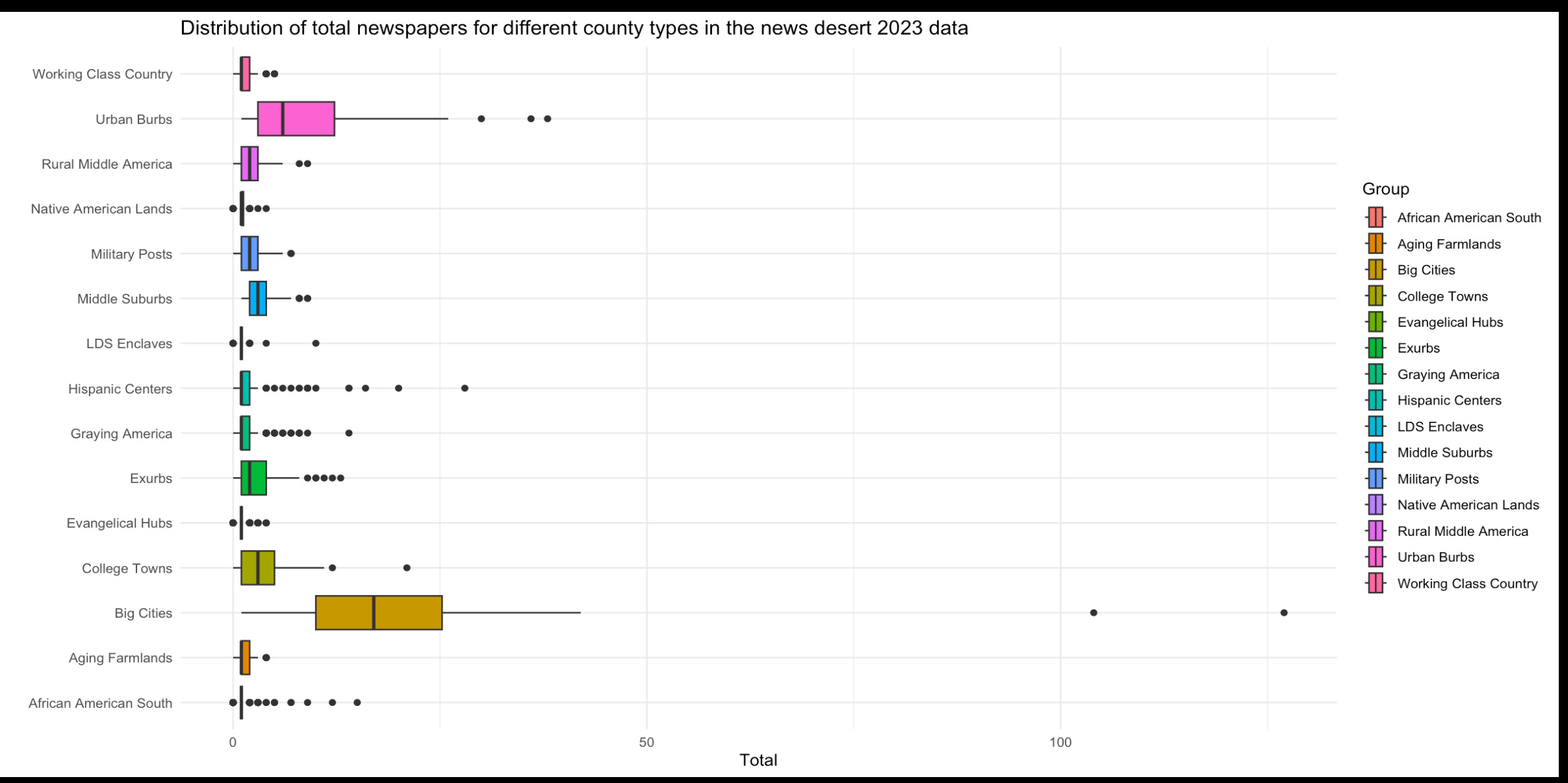
And I couldn’t figure out the easiest best way to do this for each type as a histogram- but I did make a lovely box plot!
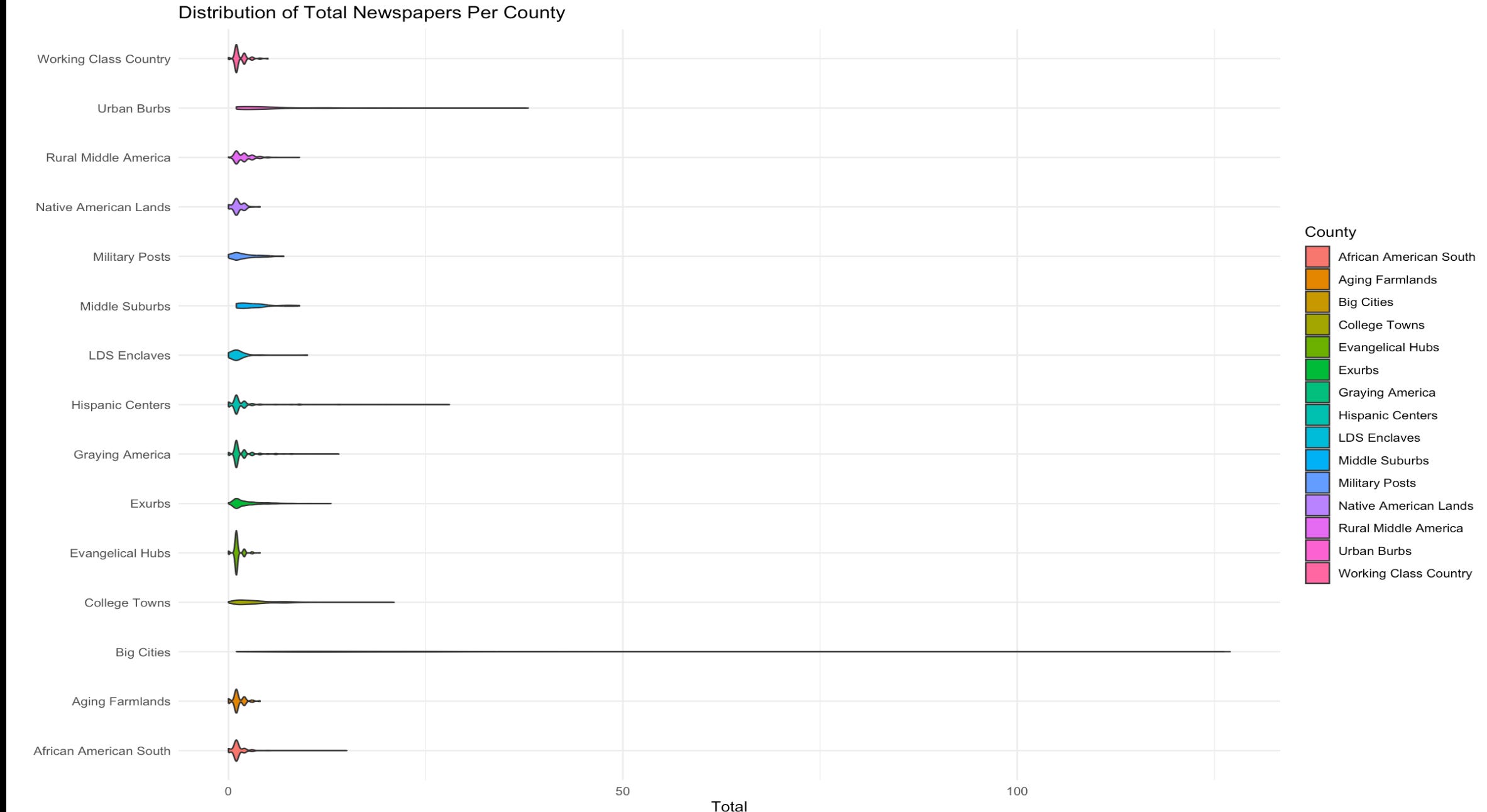
and then I made a violin plot!
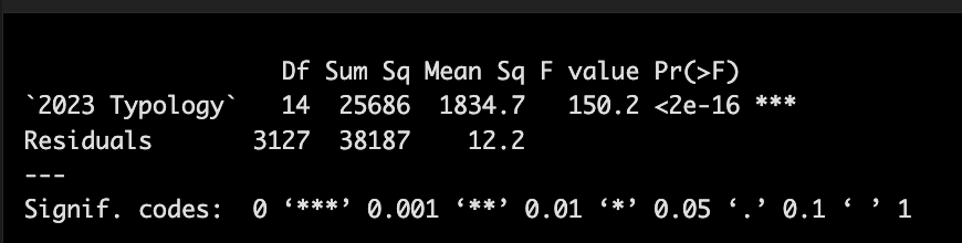
A basic ANOVA tells you that the county types absolutely seem to matter to the total # of newspapers in a county - that there is some relationship that is highly statistically significant, but this doesn’t tell you much! The pairwise tests were a bit nonsensical.
And in the end, I’m pretty interested in the relationship with voting and partisanship, at least for this fun game. So, I took some of the 2020 election data per county from MIT’s election database and cleaned it a little bit to create a Trump vote share variable at the county level for the presidential elections. I then transformed the community type into basically 15 different dummy variables, one for each type of county, and then ran a bunch of regressions to look at relationships.
First thing, since we aren’t playing by the rules, we’re going to mess with association and direction:
does total # of newspapers in a county predict vote share, just generally?
um, what we expect: there is a statistically significant relationship; for every one unit increase in newspapers (not exactly the same as for every newspaper), there is a corresponding -.004 decline in Trump vote share. This is highly significant, but that is a TERRIBLE R2s, so it doesn’t really explain what’s happening all that well.
Fine, let’s try this the other way, does Trump vote share predict total # newspapers, generally? Again, we see a relationship such that for every one unit increase in vote share for Trump, there is a corresponding .71 unit decrease in the number of total newspapers per county. Again, terrible R2.
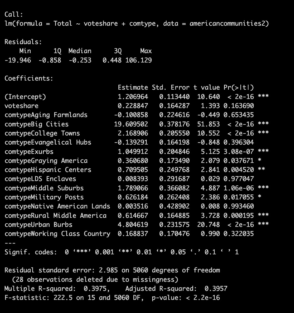
What happens when we add county type to the mix? In this case, we already know that demographics played a big role in vote share. So that’s not super interesting. What is more interesting is whether the vote share and the county type might somehow predict the health of a local newspaper ecology in a county, as measured by county type?
Well, voteshare on its own, holding community type constant, doesn’t predict the total newspapers in a county.
However, if we look at the community type, holding GOP vote share constant (controlling for GOP-ness, basically), we find that some county types do a better job than others in terms of being relevant to the total number of newspapers in each county. What more, the model isn’t half bad -about 40 percent of the variation in our data is explained by our model.
For example, Big Cities, College Towns, Exurbs, Graying America, Hispanic Centers, Middle Suburbs, Military Posts, Rural Middle America, and the Urban Burbs are all community types that are statistically significant in being positively associated with a higher total of newspapers, other communities held constant - in other words, Big cities, do, in fact, have statistically significant more total newspapers compared to other types of counties. In this case, the marginal effects are helpful: we see that big cities tend to have way more newspapers (19 unit increase) than other counties — the type of place matters for some places more than others when it comes to predicting the health of a local news ecosystem.
Whether a place Working Class Country, Hispanic Centers, Aging Farmlands, Evangelical Hubs, Native American Lands really doesn’t seem to matter insofar as predicting whether there are more or less newspapers present, relative to other community types and holding vote share constant. That’s helpful.

Ok, fine, so let’s assume that vote share has some impact - that the more a county is Trumpy, perhaps that intersects with lack of trust in media, and so there are fewer newspapers or something like that. See the following table:
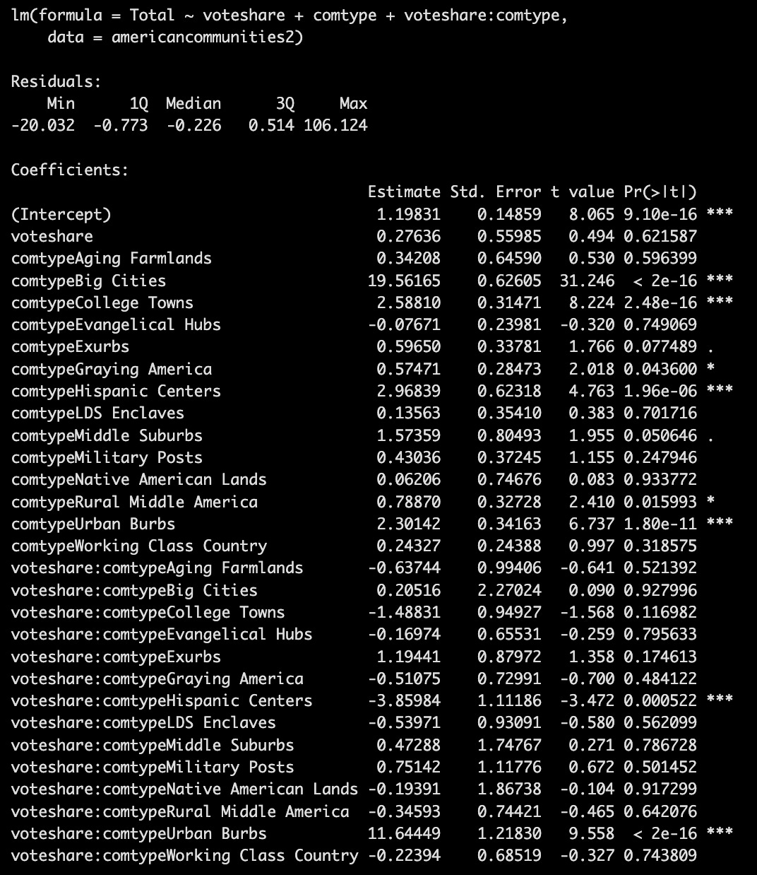
Ok, so look, we do find some really important takeaways with this interaction term: the heterogenous effect of GOP vote share on the relationship between the county type and the number of newspapers in those counties matters for some counties —Hispanic Centers and Urban Burbs. Also, this model seems to be a little more predictive, with a Multiple R-squared: of 0.4141, or 41 percent of the variance in our model is explained by the regression equation.
Notably, the effect of GOP vote share in a Hispanic Center seems to strongly negatively associated with the number of total newspapers in a total county. Which I take to mean, the greater the GOP vote share, the fewer the newspapers in a Hispanic Center county.
Same thing for the Urban Burbs, the effect of GOP vote share in an Urban Burb seems to strongly positively associated with the number of total newspapers in a total county. So the greater the GOP vote share, the more the likely an Urban Burb is to have more total newspapers. This seems weird, so let’s make vote share a bit easier to interpret.
Changing vote share to a big partisan shift =
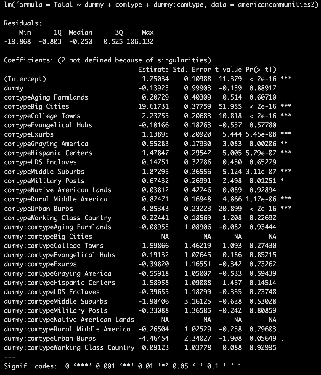
What I did was group the vote share data into a 70% or more Trump county or not a 70% or more Trump county, in other words 1 = 70% Trump vote share, 0 basically less than 70% Trump vote share. This makes it a lot easier to understand how a bigger Trump vote might be part of the story. With just the “dummy” alone, we get the following output:
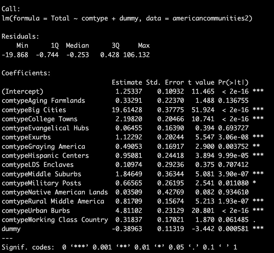
The R2 doesn’t change that much, which seems good. And we do see that extreme Trump vote share, holding everything else constant, is really very much predicting whether a county will have fewer total newspapers, regardless of the type of place it is. We are predicting this, this makes sense theoretically. But!
However, what about any potential interaction of a super partisan place on a county type? Does a huge Trump vote share have some sort of relationship with a county type such that we get a significant effect on total newspapers?
This is funny because the reality is some county types drop out. There was not a single big city county that had more than 70% vote share - NA. Same with Native American Lands.
The only real note of interest that we see is that in the Urban Burbs that voted 70% for Trump or more, there is a 4 unit decrease in total predicted newspapers for that county type, all else equal (all other county types).
There are lots of things I don’t know: tests to make sure assumptions of the data hold, how to properly query data and sort it, whether running this sort of regression is legit, how to build in other variables or whether that matters, and beyond.
But not bad kid, huh?
Errata:
In case you were curious about total # of county types - with 15, a bar chart is a little hard to read

News from the Rich, White, and Blue table: